고정 헤더 영역
상세 컨텐츠
본문

<!DOCTYPE html>
<html lang="en">
<head>
<meta charset="UTF-8" />
<meta name="viewport" content="width=device-width, initial-scale=1.0" />
<title>Document</title>
<link href="css/blog.css" rel="stylesheet" />
</head>
<body>
<div class="container">
<div class="left-container">
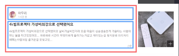
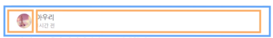
<img class="profile-img" src="puppy.jpeg" />
<p>아우리 <br /><span class="time"> 1시간 전 </span></p>
<h3 class="title">4K빔프로젝터 가성비최강으로 선택했어요.</h3>
<h5 class="content">어쩌구저쩌구쌸ㄹ랄랄ㄹ</h5>
</div>
<div class="right-container">
<img src="cat.jpg" />
</div>
</body>
</html>
.container {
  width: 800px;
}
.left-container {
  width: 60%;
  float: left;
}
.right-container {
  width: 40%;
  float: left;
}
.profile-img {
  border-radius: 100px;
  width: 100px;
  height: 80px;
  float: left;
  margin: 10px;
}
p {
  float: left;
}
.time {
  font-size: 12px;
  color: grey;
}
.title {
  margin: 15px;
  clear: both;
}
.content {
  margin: 15px;
  color: grey;
}
무엇을 만들든 레이아웃은 항상 박스부터 만들고 시작해라.
만들고자하는 디자인위에 전부 박스를 그린다.
그리고 이 박스들을 전부 <div>로 구현해놓으면 된다.
그리고 안에 글넣고 그림넣고 하면 끝
기억을 해야 할 것은 <div>는 그냥 쓰면 display : block 때문에 위아래로 배치된다.
좌우로 나란히 배치하고 싶으면 float, 혹은 inline-block 쓰면 된다.
margin 속성으로 상하좌우 마진을 한꺼번에 줄 수 있다.
상 우 하 좌측 순
.box {
  margin : 10px auto 30px auto;
}
PC 레이아웃을 만들 때 항상 container 또는 wrap 박스를 만들어놓는게 좋다.
<div class="container">
  <div class="left"></div>
  <div class="right"></div>
</div>
container 박스엔 항상 width를 지정해놓는게 좋다.
그래야 나중에 브라우저화면이 축소되어도 내부 div 박스들이 찌그러지지 않는다.
위의 내용 참고하여서 새롭게 응용한 문제
<!DOCTYPE html>
<html lang="en">
<head>
<meta charset="UTF-8" />
<meta name="viewport" content="width=device-width, initial-scale=1.0" />
<title>Document</title>
<link href="css/blog.css" rel="stylesheet" />
</head>
<body>
<div class="container">
<div class="blog-content">
<div>
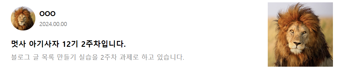
<img class="blog-profile" src="lion.jpg" />
<div class="blog-name">
<h4 class="name">OOO</h4>
<p class="time">2024.00.00</p>
</div>
</div>
<div style="clear: both">
<h3 class="title">멋사 아기사자 12기 2주차입니다.</h3>
<p class="content">
블로그 글 목록 만들기 실습을 2주차 과제로 하고 있습니다.
</p>
</div>
</div>
<div class="blog-img">
<img src="lion.jpg" style="width: 100%" />
</div>
</div>
</body>
</html>.container {
width: 800px;
display: block;
margin-left: auto;
margin-right: auto;
}
.blog-content {
width: 80%;
height: 200px;
float: left;
}
.blog-img {
width: 20%;
height: 200px;
float: left;
}
.blog-profile {
float: left;
width: 60px;
border-radius: 100px;
padding: 10px;
}
.blog-name {
float: left;
}
.name {
margin: 15px 0px 3px 0px;
font-size: 17px;
}
.time {
font-size: 14px;
color: grey;
margin: 5px 0px 3px 0px;
}
.title {
margin: 10px;
padding-top: 10px;
}
.content {
margin: 10px;
color: grey;
}'HTML, CSS' 카테고리의 다른 글
| HTML 기초와 개발환경 셋팅 (0) | 2024.02.14 |
|---|---|
| form 만들기 (0) | 2024.01.21 |
| display: block, inline-block (0) | 2024.01.21 |
| 이미지와 div 가운데 정렬, float: left로 <div> 가로 정렬 (1) | 2024.01.15 |
| [CSS] transition, animation, flexbox, Tailwind CSS (0) | 2023.03.29 |


